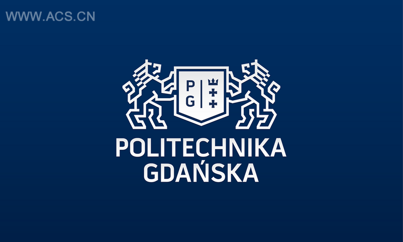
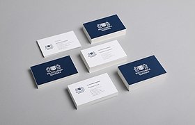
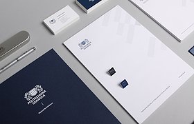
The new logo underscores the institution’s tradition and long history as part of the city of Gdansk’s landscape,
while also supporting its image as a modern technological university, dedicated to innovation and dynamic growth.
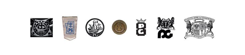
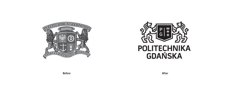
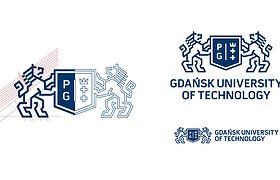
The modern design, d on a synthesis of effective visual language elements, is an interpretation of the historical and symbolical crest of the city, which is home to the university. It embraces familiar and recognizable themes, both symbolical and allegorical, associated with the centuries old visual identity of Gdańsk.
The natural connection of the symbolism of the location and the university create a mutually complimentary graphic structure, reflecting the symbiosis in which the city and university coexist. The logo’s level structure emphasizes the balance represented by the various elements within the mark. The lion silhouettes, together with the university’s initials and the emblem of Gdansk combine inseparably on a level of symbolic and graphical meaning.