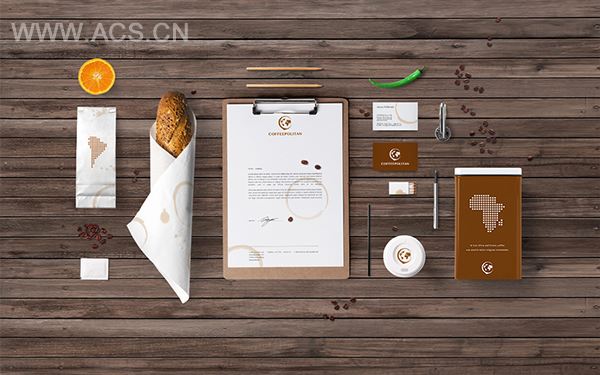
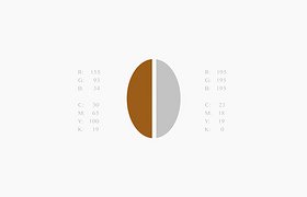
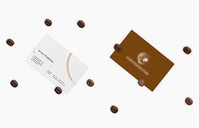
The creative process was divided into several steps, each requiring critical solutions. The color palette as well as the Typeface were chosen d on the overall brand strategy. As the next step of creative process, the core of the Logo - the Logo-mark was brainstormed and the three significant elements were included into the Logo-mark development: Coffee spot, the earth map as well as the "C" letter, which stand for the first letter of the brand name. All three elements were creatively integrated into the logo-mark, thus fulfilling the Logo. The Brand Identity completely resembles the logo philosophy and the positioning, at the same time providing the brand potential for further growth and recognition.