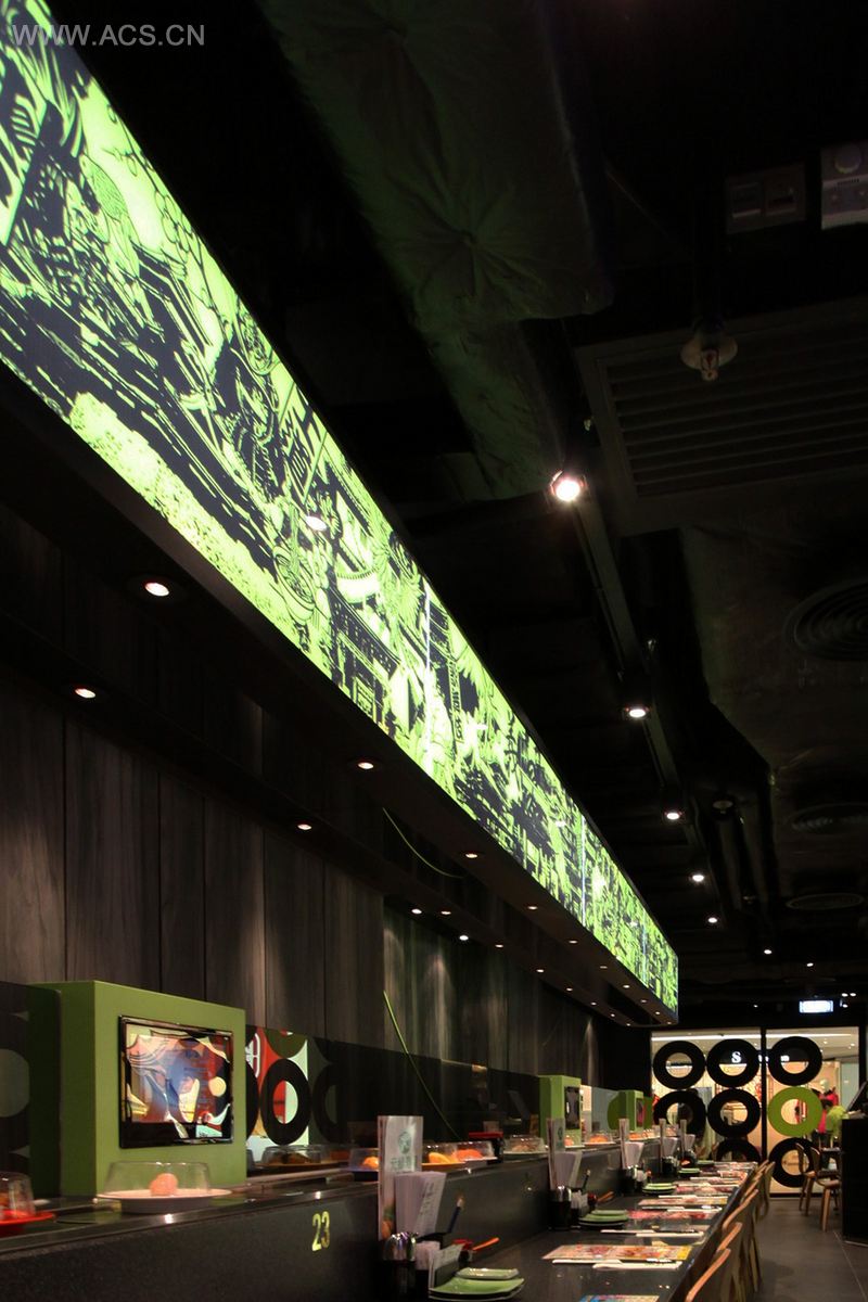
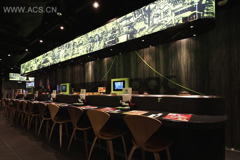
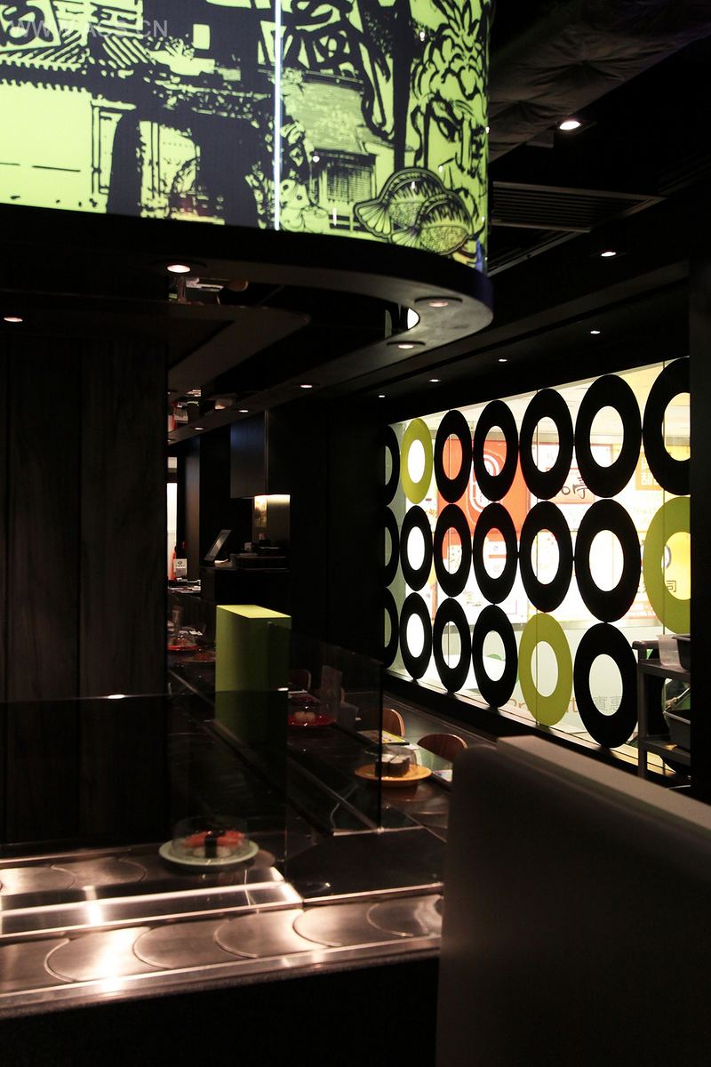
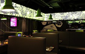
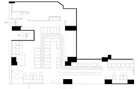
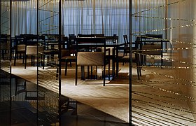
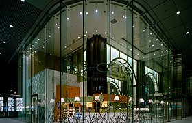
G. Sushi has been a renowned chain restaurant of conveyor-belt sushi in Hong Kong since 1989. For this revolution of brand image and marketing, the interior design aims to provide an all-new dining experience for the target customer.
Dynamic and contrasting approach expresses the energetic and upbeat atmosphere which are just people expected in the space for dining. A fresh green color is a leading role in the design element. As a brand logo, a green “donut” icon interprets the Chinese brand name “circle and green” graphically. A series of modern and aged Japanese iconic graphic chips weave a stylish picture for explaining a story of Japanese trendy culture. Dynamic green curve line featured on raw dark wood paneling to be a playful highlight in the homey environment. It is also ded a meaning of crossover of new cuisine and raw natural food as well as an innovation in their industry.